 Younès Benallal
Lead Generation Form Examples: Boost Your Conversions
Updated on September 30, 2025Every day, thousands of potential customers visit your website. But how many actually convert into leads? The difference often lies in your forms.
These crucial touchpoints convert casual browsers into valuable contacts. We'll explore the most effective lead generation forms that top companies use to fill their sales pipeline. Examples include one-click newsletter signups that grow your email list and dynamic product configurators that engage prospects.
What is a Lead Generation Form?
Lead generation forms are the digital gateways that convert casual website visitors into valuable business prospects. Unlike standard contact forms, these specialized tools are strategically designed to capture relevant information. They also offer something valuable in return, whether it's a product demo, exclusive content, or personalized recommendations.
Think of lead generation forms as digital conversations with your potential customers. Just as you wouldn't ask someone for their life story during a first meeting, these forms need to strike the right balance.
They must gather necessary information while respecting the user's time and privacy. They come in various formats, from simple email collection forms to sophisticated multi-step questionnaires that adapt based on user responses.
The most effective lead generation forms share three core characteristics:
- Value Exchange: They clearly communicate what users will receive in exchange for their information. This could be a whitepaper, product demo, or personalized consultation.
- Strategic Field Selection: Each form field serves a specific purpose. This could be in qualifying leads or personalizing the follow-up experience.
- Contextual Relevance: The form appears at the right moment in the user journey, when visitors are most likely to convert.
They're often the first interaction between your brand and a potential customer. They can set the tone for the entire customer relationship, demonstrating professionalism, attention to detail, and respect for the user's time.
The examples we'll explore in this guide demonstrate how leading companies are mastering this balance to drive conversions while building trust with their audiences.
Demo Request Form Examples
Demo request forms are crucial touchpoints for SaaS companies to qualify leads and start sales conversations. Let's see how industry leaders design these forms to increase conversions while gathering essential information.
Airtable Demo Request Form
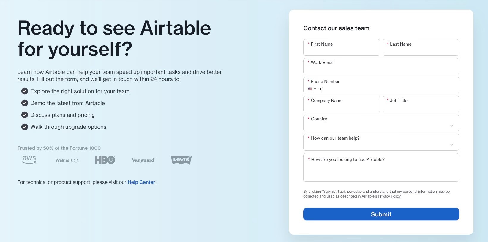
Airtable's approach is straightforward. Their form captures essential business information through eight fields, from contact details to use case exploration. The effectiveness of this form comes from its strategic balance between gathering necessary qualification data and keeping it simple.
The inclusion of "How are you looking to use Airtable?" helps sales teams personalize follow-ups and prioritize leads by use case.
Notion Demo Request Form
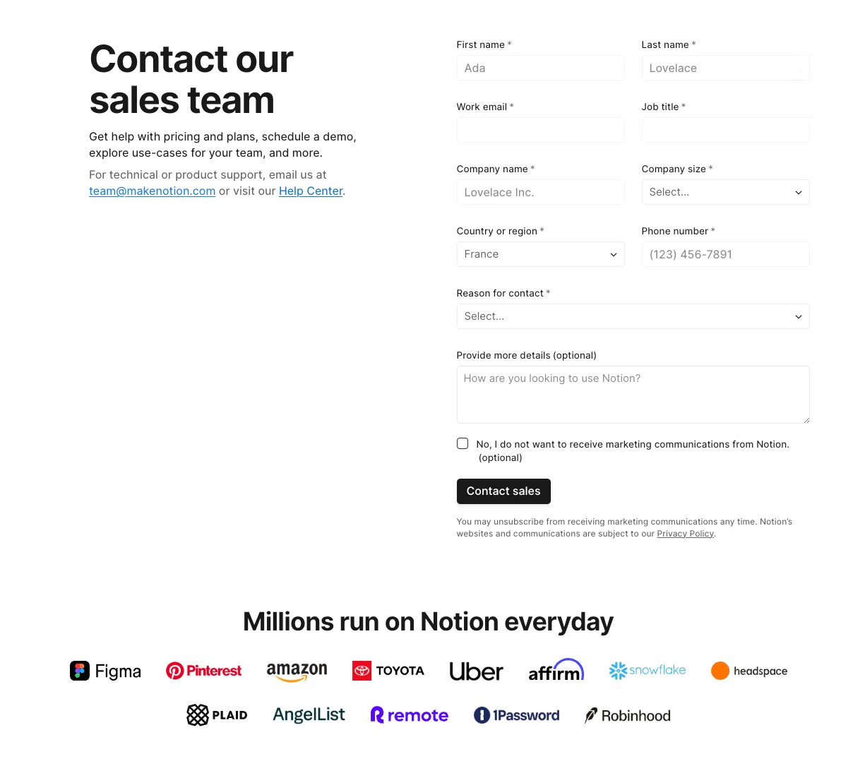
Notion takes a slightly more detailed approach with their demo request form. Beyond standard contact information, they include company size and marketing preferences, which helps segment leads and comply with privacy regulations.
Their form shows how to gather information without making the form look cluttered. The "Reason for contact" field stands out because it helps route inquiries to the appropriate team members.
Notion builds credibility by displaying logos of prominent corporate customers, reassuring potential clients of their proven track record.
HubSpot Demo Request Form
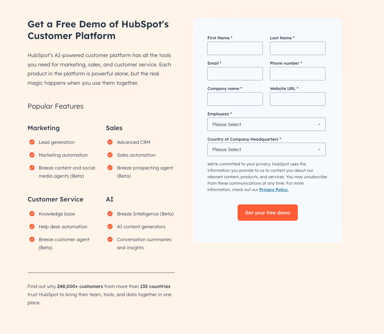
HubSpot's form is similar, but it adds its own lead qualification techniques. They structured their form to gather detailed business information while keeping users engaged. They understand their enterprise audience and know their qualified leads will provide detailed information.
These demo request forms show how leading companies balance lead qualification data with user experience. Request enough information to qualify leads and keep the form easy to complete.
Ecommerce Lead Generation Form Examples
Ecommerce lead generation forms have changed from simple email collection. Today's most effective forms create personalized experiences. They guide customers through product discovery while collecting valuable data.
Let's examine three innovative approaches that show how to turn form filling into an engaging customer journey.
Elmut: Animal Food Test Form
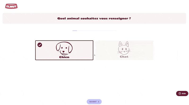
Elmut's multi-step form brilliantly transforms what could be a mundane pet food selection into an interactive consultation. By starting with basic questions about pet type and gradually progressing to more specific questions about age, breed, and activity level, they create a natural conversation flow.
They smartly wait to ask for contact information until after offering value, such as personalized calorie calculations and meal suggestions. This approach shows how breaking down complex decisions into simple steps can make form completion feel effortless while gathering detailed customer data.
Typology: Skin Diagnostic Form
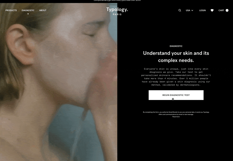
Typology Paris shows how to make a diagnostic form feel like a professional skincare consultation. Their seven-step process intelligently combines lifestyle factors with skin concerns to create highly personalized recommendations.
This form is effective because of its holistic approach. It considers not just skin type but also environmental factors and product preferences. The clean, minimalist design mirrors their brand identity, while the progressive disclosure of questions reduces cognitive load and keeps users engaged through completion.
Precision Fuel & Hydration: Hydration Plan Builder Form
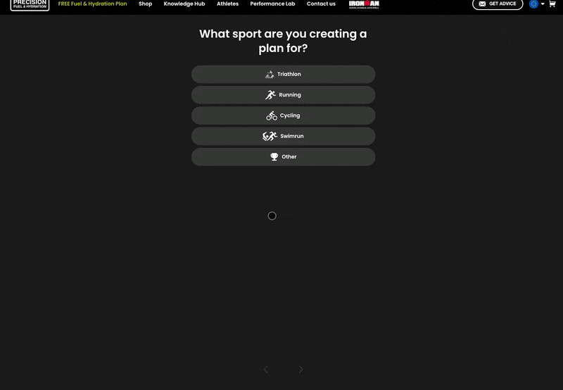
This form illustrates how to turn technical product selection into an engaging experience for athletes. By focusing first on sport-specific details and gradually moving toward personal training habits, they build credibility while collecting valuable customer data.
The form excels at making complex hydration science accessible through simple, targeted questions. The clear progress indicator and sport-specific language demonstrate deep understanding of their audience, making users feel confident they'll receive truly personalized recommendations.
These examples share several key success factors. They:
- Prioritize value delivery before data collection
- Ask questions that flow logically from general to specific
- Ensure each step feels purposeful and contributes to the final recommendation
The forms also match their brand's voice and expertise level. They transform what could be tedious data collection into interactive experiences.
When designing multi-step forms for ecommerce, focus on creating a journey that feels less like filling out a form and more like having a conversation with an expert. This approach not only improves completion rates but also provides richer customer data for personalization.
Want to explore how AI chatbots can revolutionize your lead generation strategy? Learn more about upselling techniques using intelligent conversational flows that can transform user interactions into valuable conversions.
Lead Magnet Form Examples
Lead magnets are valuable resources offered in exchange for contact information. When designed thoughtfully, they can significantly boost conversion rates while providing immediate value to potential customers.
Mailchimp Whitepaper Form
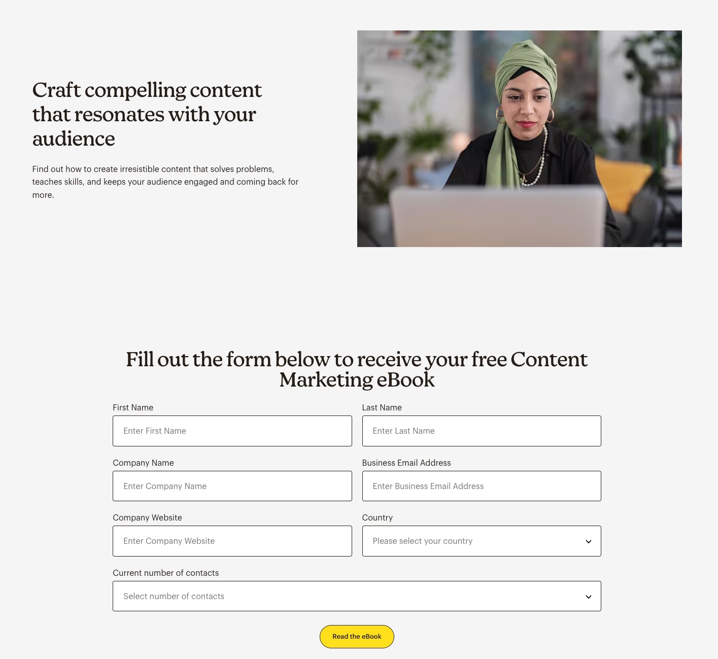
Mailchimp's content marketing ebook form shows effective lead capture through strategic placement and a clear value proposition. By embedding their form within blog posts, they catch readers already engaged with related content.
Their form includes essential fields like name, company details, and business email. The prominent "Fill out the form below to receive your free Content Marketing eBook" text clearly communicates the value exchange.
Here's what makes it effective:
- Strategic mid-content placement captures readers at peak interest
- A clear value proposition with "free" emphasized
- Professional fields that signal a B2B focus
- Progressive form layout that isn't overwhelming
Unbounce Report Form
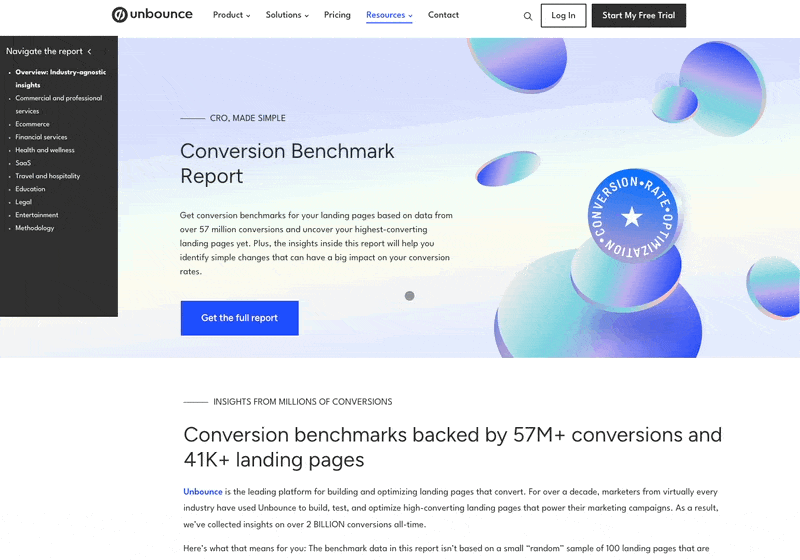
Unbounce's Conversion Benchmark Report form uses an interesting "preview and blur" technique that builds curiosity. By showing a portion of the valuable content and blurring the rest, they create immediate desire for the full report.
Their streamlined form requests only business-critical information: name, company type, company name, and business size.
Here's what makes it effective:
- The preview/blur technique creates psychological investment
- Focused form fields qualify leads while minimizing friction
- An industry-specific report appeals to their target audience
- Clean, professional design matches their brand
Both examples showcase how lead magnets can be more than just data collection tools. They're opportunities to demonstrate expertise and provide immediate value. The key is balancing the perceived value of the offered content against the amount of information requested. Mailchimp's comprehensive approach works for their established brand, while Unbounce's focused strategy aligns with their conversion optimization expertise.
When creating your own lead magnet forms, consider the following:
- Matching form fields to the value of your offer
- Using strategic placement that aligns with user intent
- Creating clear, benefit-focused copy that emphasizes value
- Designing forms that reflect your brand's professionalism
Remember, the goal isn't just to collect information, it's to begin a value-based relationship with potential customers.
Newsletter Form Examples
Newsletter forms are effective lead generation tools. Strategic placement and thoughtful design enhance their performance. Let's examine three approaches that demonstrate successful strategies.
TheReview from FirstRound Form
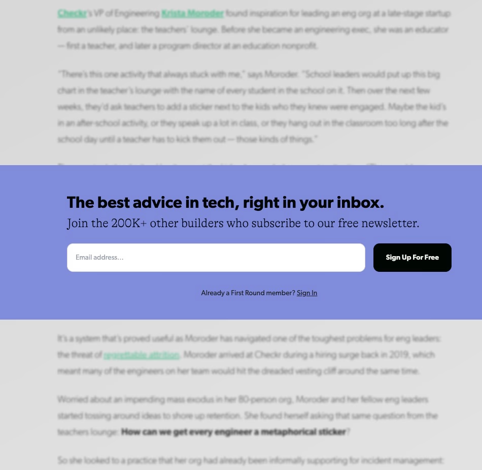
TheReview from FirstRound uses a minimalist popup newsletter form on its blog posts. They request only an email address, reducing friction. This strategy works well because:
- The form appears when readers are already engaged.
- It maintains focus with a single field.
- The timing of the popup suggests readers already trust the content quality.
This simple approach can be highly effective for quickly capturing leads from engaged readers.
NeilPatel Form
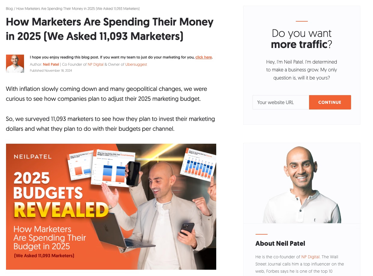
Neil Patel's sidebar form stands out with its direct, personality-driven approach. The copy "Do you want more traffic?" immediately addresses a core pain point. This form is effective because:
- Neil's personal introduction creates an immediate connection.
- It has a clear value proposition focused on business growth.
- Strategic placement alongside blog content maintains context.
- The direct question in the headline taps into the visitor's motivation.
This personal and direct approach can be very effective for engaging visitors.
Salesloft: Sidebar Form for Newsletter
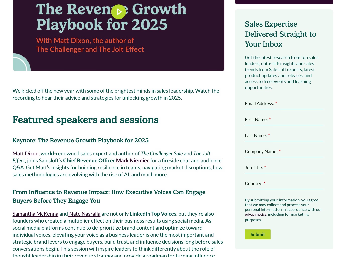
Salesloft uses a more comprehensive approach with their blog sidebar form. They collect detailed information while maintaining relevance. Their form demonstrates how to ask for more information without deterring submissions:
- Fields (email, name, company, job title, country) align with their B2B focus.
- Sidebar placement provides persistent visibility without interrupting reading.
- Form length matches their enterprise audience expectations.
This detailed approach is suitable for B2B contexts where more information is needed for lead qualification.
Each example shows how context and audience understanding should drive form design decisions.
FirstRound optimizes for quick conversion. Neil Patel builds a personal connection. Salesloft gathers detailed data for B2B targeting. Matching form complexity to your audience's expectations and the value they'll receive in return is key.
When implementing newsletter forms, consider your audience's patience and the perceived value of your offering. A thought leadership blog might succeed with a simple email capture. A professional service might need more details to properly segment and nurture leads.
Free Trial Form Examples
Free trial forms are a crucial gateway for potential customers to test software products. The best ones balance collecting essential information and maintaining a low-friction signup process.
Tableau Free Trial Form
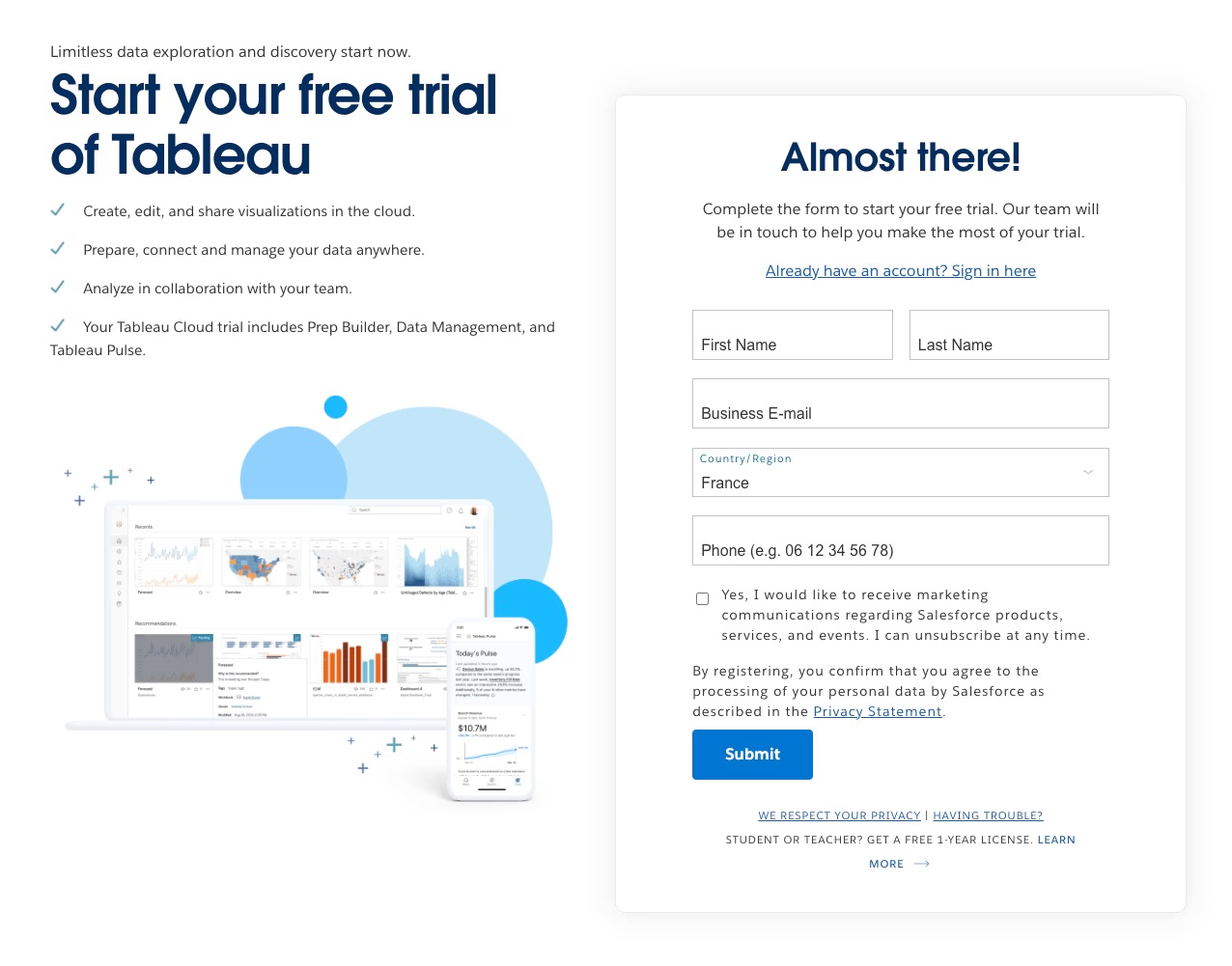
Tableau uses a direct approach with their free trial form, accessible through their main CTA. Their form demonstrates strategic minimalism by requesting only the most crucial information: first name, last name, business email, country, and phone number. This approach reduces friction while still capturing the essential data needed to qualify leads and follow up effectively.
What makes it effective:
- Placement directly from the main CTA creates a clear path to conversion.
- Limited field count minimizes abandonment risk.
- Strategic including of the country field helps assign sales territories.
- Business email requirement helps filter quality leads.
Zoho Analytics Free Trial Form
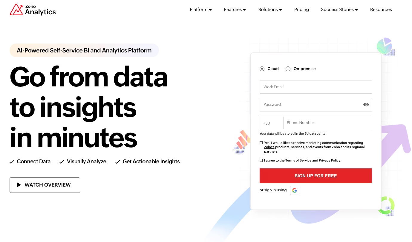
Zoho Analytics stands out with their landing page-integrated trial form that emphasizes immediate access. Their approach is user-centric, requiring just email, password, and phone number, while also offering deployment flexibility with cloud or on-premise options.
Key strengths:
- Minimal friction with just three required fields.
- Immediate access philosophy.
- Deployment choice upfront prevents future friction.
- Password creation in the initial step allows instant account setup.
Zendesk Multi-step Form
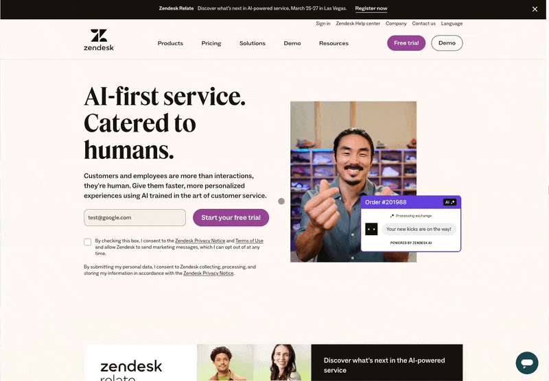
Zendesk employs a sophisticated 9-step form that breaks down the signup process into digestible chunks. This approach allows them to collect comprehensive information while maintaining user engagement. The form requests email, personal details, company information, employee count, language preference, and subdomain selection.
Smart design elements:
- Progressive disclosure reduces perceived complexity.
- Step indicator provides clear progress visibility.
- Logical information grouping.
- Immediate software access after completion incentivizes completion.
Each of these examples demonstrates different approaches to free trial form design, from Tableau's minimalist efficiency to Zendesk's comprehensive but structured approach.
Supercharge Your Lead Generation with Typebot
Why Choose a Conversational Chatbot for Lead Generation?
Traditional forms are functional, but they often create a one-sided experience. Users passively fill out fields.
Conversational interfaces fundamentally shift this dynamic. They create an interactive dialogue that feels more natural and engaging. This approach mirrors human conversation, making the lead generation process feel less like a transaction and more like a helpful exchange.

Typebot's conversational forms shine in complex lead qualification scenarios. Instead of overwhelming prospects with a long form, you can break down the information gathering into a natural flow of questions.
This progressive disclosure technique has proven to significantly increase completion rates. Users are more likely to finish a conversation than a traditional form.
With OpenAI integration, Typebot enables hyper-personalized responses by dynamically adapting the conversation based on user inputs and contextual understanding.
How Typebot Can Help You Create Engaging Lead Generation Forms
Typebot's visual builder empowers you to create sophisticated lead generation flows without writing code. You can design conversations that adapt based on user responses. This is similar to the personalized approaches we saw in Elmut's pet food quiz or Typology's skin diagnostic.
Typebot offers several key advantages:
- Dynamic Conversations: Unlike static forms, you can show different questions based on previous answers. This is similar to how Typology's skin diagnostic adjusts its recommendations.
- Multi-Step Logic: Create sophisticated qualification flows that feel natural. Break down complex forms into digestible chunks like Zendesk's approach.
- Rich Media Integration: Enhance engagement by incorporating images, videos, or custom elements into your conversation flow.
- Real-Time Validation: Ensure data quality with built-in validation for emails, phone numbers, and custom formats.
- Native Analytics: Track completion rates and identify where users drop off to optimize your conversion funnel.
The platform's flexibility allows you to implement advanced features. Examples include calendar booking (similar to meeting booking forms) or complex logic flows (like product configurators).
By combining the best practices we've seen in traditional forms with conversational design, Typebot helps you create lead generation experiences. These experiences not only collect information but also engage and qualify prospects effectively.
Want to take your lead generation to the next level? Learn how to add a chatbot to your website and create interactive experiences that convert visitors into qualified leads.
Best practices for creating effective lead generation forms
Customize your lead generation forms
Your form should reflect your unique business needs and target audience. For B2B companies like Airtable and Notion, collecting company information is crucial.
However, for B2C businesses like Elmut or Typology, focusing on personal preferences and needs yields better results. Adapt your form fields based on your specific use case while maintaining clarity and purpose.
Keep your lead generation forms focused
Every field in your form should serve a clear purpose. Precision Fuel & Hydration exemplifies this principle perfectly. Each question directly contributes to creating a personalized hydration plan.
When adding a new field, ask yourself: "Will this information help us serve our customers better?" If the answer isn't a clear "yes," consider removing it.
Simplicity is key for lead generation forms
The most effective forms, like Zoho Analytics' three-field signup, prove that simplicity works. Start with essential fields and gradually collect additional information through progressive profiling or follow-up interactions.
Incorporate brand personality in your lead generation forms
Your form should feel like a natural extension of your brand. Notice how Neil Patel's conversational approach ("Hey, I'm Neil Patel") makes his lead generation form feel more personal and approachable. Consider incorporating your brand voice and personality into form labels, helper text, and CTAs.
Tweak and optimize your lead generation forms
Implement A/B testing to continuously improve your forms. When A/B testing, consider testing different aspects of your forms, such as:
- Form length and field order
- CTA button text and design
- Form placement and timing
- Error message wording
- Success message content
Regular A/B testing will help you optimize your lead generation forms.
Mobile lead generation tips
With increasing mobile traffic, optimizing for smaller screens is crucial. Consider these mobile-specific best practices:
- Use single-column layouts for better readability
- Implement larger touch targets for buttons and inputs
- Enable autofill where possible
- Use appropriate mobile keyboard types for different fields
- Break long forms into steps, like Zendesk's approach
Optimizing your lead generation forms for mobile is essential.
What Makes a Great Lead Generation Form?
A great lead generation form balances gathering valuable information with maintaining user engagement. Let's explore the key elements that transform a basic form into a conversion powerhouse.
Clear Value Proposition
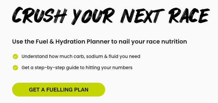
The most effective forms immediately answer the question, "What's in it for me?" Precision Fuel & Hydration's form promises a personalized hydration plan, making the value clear from the start.
Users understand they'll receive tailored advice in exchange for their information, which significantly boosts completion rates.
Compelling Call to Action
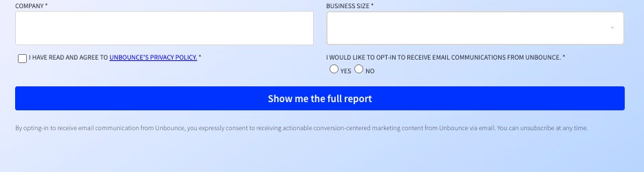
Your CTA can make or break your form's success. Consider how Unbounce's "Show me the full report" is specific and value-focused, unlike generic "Submit" buttons.
The best CTAs use action-oriented language and highlight the immediate benefit. They also create a sense of urgency when appropriate and match the user's intent.
Minimal Form Fields
Smart forms like Zoho Analytics' demonstrate the power of minimalism. They request only email, password, and phone number for their trial signup. This approach follows a crucial principle: ask only for information that's absolutely necessary at this stage of the relationship.
The key is progressive profiling. This means collecting additional information over time rather than all at once. For instance, Typology's skin diagnostic form breaks down multiple questions into digestible steps. This makes the process feel less overwhelming, even though it collects detailed information.
Want to see more detailed examples of progressive profiling and mobile-optimized forms in action? Check out our comprehensive lead generation form examples to see how top companies balance information collection with user experience.
Common Mistakes to Avoid in Lead Generation Forms
Not Optimizing for Mobile
Mobile optimization is often overlooked, even though mobile traffic accounts for over half of all web visits. Typology and Precision Fuel & Hydration demonstrate excellent mobile-first design with their step-by-step forms that adapt to smaller screens. Their success comes from:
- Single-column layouts that eliminate horizontal scrolling
- Touch-friendly input fields and buttons
- Adequate spacing between clickable elements
- Progressive disclosure of form fields to prevent overwhelming users
Asking for Too Much Information Upfront
The difference between Zoho Analytics' minimalist approach (email, password, phone) and more demanding forms like Mailchimp's reveals a key lesson. Mailchimp's form requires detailed information for a specific purpose. However, many businesses load their forms with unnecessary fields.
Consider Airtable's strategy. They initially collect only business-critical information (name, email, company) and gather additional data through follow-up interactions. This approach balances high conversion rates with valuable lead information collection.
Ignoring Data Privacy
Modern lead generation forms must address growing privacy concerns. Notion's form demonstrates good privacy practices by:
- Including clear GDPR compliance checkboxes
- Explaining how collected data will be used
- Providing links to privacy policies
- Offering granular marketing preferences
Transparency is key. Users are more likely to share information when they understand how it will be used and have control over it. Hubspot's form excels at this by clearly stating data usage intentions upfront and providing multiple opt-out options.
Poor Form Validation
Form validation is crucial for maintaining data quality and user experience, even if it's not immediately obvious. Common mistakes include:
- Displaying error messages only after form submission
- Unclear error messaging
- Overly strict validation rules
- Lack of real-time validation
The best forms, like Zendesk's multi-step process, validate inputs as users type. They also provide immediate, helpful feedback without disrupting the user's flow.
Missing Clear Value Propositions
Neil Patel's sidebar form works because it directly addresses the reader's main concern: "Do you want more traffic?" Generic newsletter signup forms often fail to communicate specific benefits. Every form should answer the question: "What's in it for me?"
Each form field adds friction to the conversion process. The key is to find the balance between gathering necessary information and maintaining a smooth user experience. Start with the minimum required fields and only add more when you can justify their immediate business value.
Tools and Platforms for Creating Lead Generation Forms
The right tools can either make or break your lead generation strategy. While traditional form builders work, modern solutions offer more engaging ways to collect leads.
Form Builders
Traditional form builders like Typeform, Google Forms, and Jotform provide solid foundations for basic lead collection. They offer drag-and-drop interfaces and template libraries. However, they often result in static, conventional forms that might not stand out.
Landing Page Builders
Platforms like Unbounce and Instapage specialize in creating conversion-optimized landing pages with integrated form capabilities. These tools excel at A/B testing and provide detailed analytics. However, they can be costly for small businesses.
CRM-Integrated Solutions
HubSpot Forms and Salesforce Web-to-Lead forms offer seamless integration with their respective CRM systems. While powerful for data management, they sometimes sacrifice user experience for functionality.
Conversational Form Builders
Typebot represents the next evolution in lead generation forms. Unlike traditional form builders, it lets you create dynamic, chat-like experiences that:
- Maintain higher engagement through natural conversation flows
- Adapt questions based on previous answers
- Integrate with various tools while keeping the interface simple
- Support rich media and interactive elements
- Provide detailed analytics without compromising user experience
The key advantage of conversational forms is their ability to make data collection feel more like a helpful discussion. This approach typically results in higher completion rates and better quality leads.
When choosing your form-building tool, consider these factors: integration capabilities with your existing tech stack, customization options to match your brand, analytics and tracking features, pricing structure and scalability, and ease of use for your team.
Remember that the best tool serves your specific lead generation goals while providing a superior experience for your potential customers. It isn't necessarily the one with the most features.
Lead generation forms are strategic tools for understanding and engaging potential customers. By implementing the insights and best practices from lead generation form examples, businesses can transform their customer acquisition approach.
They can also create more personalized, intuitive, and effective conversion experiences. As digital interactions evolve, those who innovate in their form design and prioritize user experience will stand out in a competitive market.